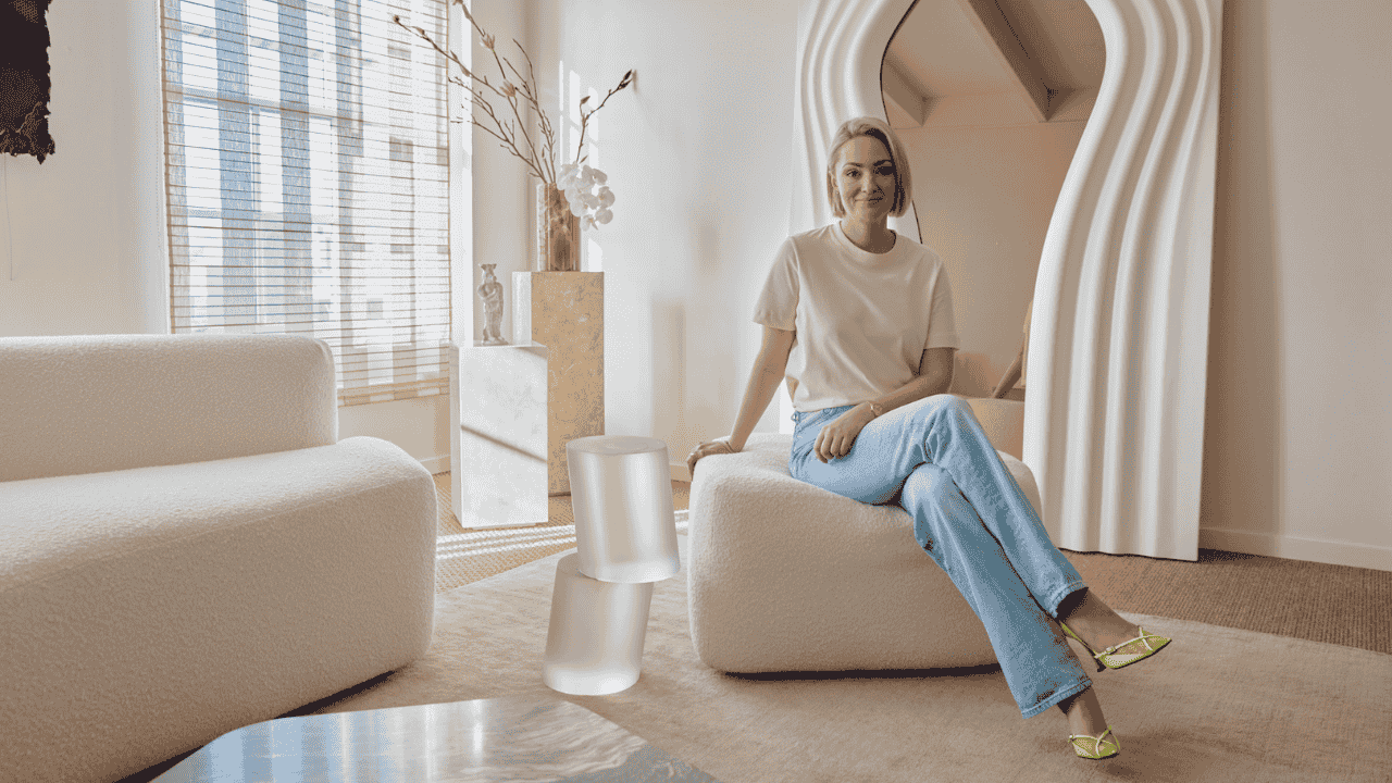
Color plays a powerful role in shaping the atmosphere of interior spaces. The creative philosophy of Studio Bryony Ella emphasizes calm, organic, nature-inspired palettes that promote balance and comfort. Rather than following bold or short-lived trends, the studio emphasizes subtle tones that reflect landscapes, natural materials, and artistic expression.
Led by interdisciplinary artist Bryony Ella, the studio integrates color as part of a broader design narrative. Each palette is chosen to enhance natural light, complement textures, and create interiors that feel both modern and timeless. These carefully selected combinations contribute to the studio’s recognizable aesthetic.
Table of Contents
Color Palette Overview
| Palette Type | Description |
|---|---|
| Earth Neutrals | Warm beige, sand, and soft browns inspired by soil and stone |
| Forest Greens | Muted greens reflecting natural landscapes |
| Soft Clay | Terracotta and clay tones adding warmth |
| Calm Whites | Natural whites used as a light and balanced backdrop |
| Organic Blues | Gentle blues inspired by sky and water |
| Textured Layers | Color combinations designed to highlight natural materials |
Nature Inspiration
Natural landscapes often inform the color philosophy of Studio Bryony Ella. Instead of synthetic or highly saturated tones, the studio typically selects shades that mirror elements found in forests, rivers, stone surfaces, and plant life. These colors help interiors feel grounded and connected to the environment.
Such inspiration encourages a sense of calm within living spaces. Natural colors tend to create visual harmony, making rooms feel welcoming and comfortable. By reflecting natural tones, interiors achieve a timeless quality that remains appealing even as design trends change.
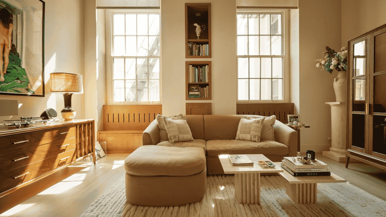
Neutral Foundations
Neutral shades form the foundation of most palettes used in interiors influenced by Studio Bryony Ella.
- Warm Beige – Creates a soft and inviting background.
- Stone Grey – Adds subtle depth without overpowering the room.
- Natural White – Enhances brightness and reflects light.
- Sand Tones – Provide warmth and connect the palette to natural materials.
These neutral colors serve as a flexible base that supports furniture, artwork, and decorative objects. A balanced neutral foundation allows other colors to appear more refined while maintaining overall harmony.
Earth Tones
Earth-inspired colors bring warmth and character into interiors. Shades such as terracotta, clay, and rust are often used to introduce subtle contrast while maintaining a natural aesthetic. These tones work particularly well with wooden furniture and handmade ceramics.
Such colors also evoke a sense of authenticity. Because they resemble natural pigments found in soil and stone, they create interiors that feel organic and grounded. This approach reinforces the studio’s emphasis on connecting design with the natural world.
Green Shades
Green is among the most frequently used colors in Bryony Ella’s palettes. Inspired by forests, moss, and plant life, these shades create a refreshing, calming atmosphere in interior spaces.
Muted greens are often preferred over brighter tones. Soft sage, olive, or moss colors blend easily with neutral walls and wooden textures. These shades also complement indoor plants, strengthening the visual link between interior design and natural environments.
Blue Accents
While neutral and earthy tones dominate the palette, gentle blue accents occasionally introduce contrast. These blues are typically soft and subdued, reflecting natural elements such as water or sky rather than bold decorative statements.
Using blue in moderation prevents the space from feeling overly cool. Instead, it adds visual depth and balance when paired with warmer tones like clay or beige. Such combinations help create interiors that feel layered yet harmonious.
Layered Textures
Color choices are closely connected with material textures in the studio’s design approach.
- Wood Surfaces – Natural wood enhances earthy color palettes.
- Linen Fabrics – Soft textiles complement neutral tones.
- Stone Details – Organic patterns add depth to calm palettes.
- Ceramic Decor – Handmade pieces introduce subtle color variations.
Layering these textures alongside carefully selected colors creates visual richness without overwhelming the space. The result is an environment that feels both elegant and comfortable.
Lighting Effects
Lighting significantly influences how color palettes appear within interior spaces. Rooms inspired by Studio Bryony Ella often rely on natural light to highlight subtle color variations throughout the day.
Warm evening lighting further enhances earthy tones and natural materials. This thoughtful use of lighting ensures that colors remain soft and balanced regardless of the time of day. As a result, interiors maintain a welcoming atmosphere under different lighting conditions.
The Way Forward
The signature color palettes associated with Studio Bryony Ella demonstrate how thoughtful color choices can transform interior spaces. By combining neutral foundations, earthy accents, and nature-inspired tones, the studio creates interiors that feel calm, elegant, and timeless.
Guided by Bryony Ella’s creative perspective, these palettes highlight the importance of harmony between design and the environment. Such an approach proves that color is not just decoration but a powerful tool for shaping atmosphere, comfort, and emotional connection within living spaces.