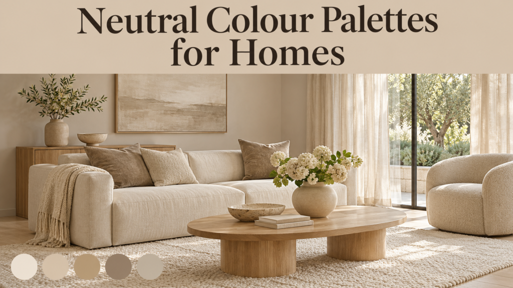
Neutral colours are the backbone of most beautiful homes. Whites, creams, beiges, greiges, taupes, stones, browns and soft greys create calm, flexible spaces that are easy to live with and easy to decorate. Neutral does not have to mean boring, though. The best neutral palettes are warm, layered and full of texture. Getting them right means understanding undertones, light, materials and how colours work together.
This guide explains what neutral colours are, the main neutral families, warm versus cool neutrals, undertones and LRV, how light changes colour, ready-made palette ideas, room-by-room advice, popular paint shades, current trends, mistakes to avoid, painting costs, and how neutrals affect home value and resale.
Table of Contents
What Is a Neutral Colour Palette?
A neutral palette is a group of low-saturation colours, such as whites, creams, beiges, greys, taupes and browns, that work as a calm background for furniture, art and accents. Benjamin Moore sums up their role simply: “Neutrals set the stage for other colours.”
A neutral palette usually covers walls, ceilings, woodwork and large surfaces, and lets you add colour through textiles, artwork and accessories. What I love about a neutral backdrop is that it gives you freedom with the color palette of your furnishings and decor.
Why Homeowners Love Neutrals
| Benefit | Why It Matters |
|---|---|
| Timeless | Less likely to date quickly than bold trend colours |
| Flexible | Works with many furniture styles and colours |
| Calm | Creates restful, uncluttered spaces |
| Light-enhancing | Lighter neutrals bounce daylight around |
| Resale-friendly | Appeals to a wide range of buyers |
| Easy to update | Change accents without repainting |
The Main Neutral Colour Families
| Family | Description | Feel |
|---|---|---|
| White | From crisp brilliant white to soft off-white | Fresh, bright, clean |
| Off-white / cream | Whites with yellow, red or brown warmth | Soft, inviting |
| Beige | Light brown with yellow or pink warmth | Warm, cosy |
| Greige | A mix of grey and beige | Balanced, versatile |
| Taupe | Greyish brown, often with a pink or purple hint | Sophisticated, grounded |
| Stone / putty | Earthy mid-tones with green or brown undertones | Natural, calm |
| Grey | From pale dove grey to charcoal | Cool, modern |
| Brown | From mushroom to espresso | Rich, warm, enveloping |
| Black / charcoal | Deep, dramatic neutrals | Bold, elegant |
Warm vs Cool Neutrals
Every neutral leans warm or cool. Benjamin Moore advises: For a cozy feel in your room, consider a warm neutral paint colour with undertones of yellow, red or orange. If you want a more open, airy vibe, consider neutrals such as white and gray that have cooler undertones like green, blue or purple.
| Feature | Warm Neutrals | Cool Neutrals |
|---|---|---|
| Undertones | Yellow, red, orange, pink | Blue, green, purple |
| Examples | Cream, beige, warm greige, stone, mushroom | Crisp white, cool grey, blue-grey |
| Mood | Cosy, welcoming, relaxed | Fresh, airy, crisp, modern |
| Best in | North-facing rooms, living rooms, bedrooms | South-facing rooms, bathrooms, modern spaces |
| Pairs with | Wood, brass, terracotta, leather | Chrome, marble, blue and green accents |
Warm neutrals are now leading. UK paint maker Mylands advises: if you want to be ahead of the trend, step away from the cool grey and towards other warmer hues like stone, cream, beige, off-white and warm white.
Understanding Undertones
Undertones are the subtle hidden colours inside a neutral that appear in certain light or next to other colours. They are the reason two “beiges” can look completely different.
- Whites can have yellow, gray, beige (brown), or blue undertones.
- Warm-leaning colors (beiges, warm greiges) can have pink, red, or yellow undertones.
- Cool-leaning shades (grays and cool greiges) show off their blue, purple, or green undertones.
Why Undertones Matter
Choosing the wrong undertone is the most common neutral mistake. As one colour expert warns: The last thing you want to choose if you dislike the color green is a neutral color with a green undertone. This is the big mistake most people make when choosing neutral paint colors for their home.
How to Spot an Undertone
- Compare the paint sample against pure white paper
- Compare it with other neutrals of similar lightness
- Look at the darkest shade on the same paint strip, which often reveals the undertone
- View samples in morning, afternoon and evening light
- Check against your floors, worktops and furniture
Match Undertones to Fixed Finishes
Your walls must work with things you cannot easily change. Don’t choose neutral paint colors in a vacuum. When choosing a neutral paint color, make sure the undertones work with your fixed finishes already in your home! That will be countertops, cabinets and even flooring.
For example, a room with lots of wood and gold or brass hardware will benefit from a warmer paint tone, whereas a space with obvious pops of colour such as blue will look better with cool undertones.
What Is LRV?
LRV (Light Reflectance Value) measures how much light a colour reflects, on a scale from 0 (pure black) to 100 (pure white).
| LRV Range | Category | Best Use |
|---|---|---|
| 80–95 | Very light (whites, off-whites) | Ceilings, dark rooms, trim |
| 60–80 | Light (pale greiges, beiges) | Living rooms, bedrooms, whole-house colour |
| 40–60 | Mid-tone (stone, taupe) | Feature walls, bright rooms, cosy spaces |
| 20–40 | Deep (mushroom, darker greige) | Dining rooms, studies, accents |
| 0–20 | Very dark (espresso, charcoal) | Dramatic rooms, cabinetry, doors |
Examples include Benjamin Moore Chantilly Lace, a LRV: 92.2 | Undertone: Nearly true white, very slight cool, and Benjamin Moore Revere Pewter with an LRV 55.
How Light Changes Neutral Colours
Natural Light by Room Direction
Natural Light: North-facing rooms tend to bring out cool tones, while south-facing rooms enhance warm undertones.
| Room Direction | Light Quality | Neutral Advice |
|---|---|---|
| North-facing | Cool, consistent, can feel dull | Choose warm neutrals; avoid cool greys |
| South-facing | Warm, bright, strong | Most neutrals work; cooler or less yellow shades keep it fresh |
| East-facing | Warm morning, cooler afternoon | Balanced or slightly warm neutrals |
| West-facing | Cool morning, warm golden evening | Balanced neutrals; avoid very yellow shades |
Warm rooms need care too. Mylands warns: Painting a warm room with a warm paint colour can equal scorching point! Opt for a warm neutral that is on the less toasty end of the scale.
Artificial Light
Bulbs change colour as well. Warm bulbs enhance creamy whites, while cool bulbs intensify blue undertones.
- Warm white bulbs (2700K–3000K): cosy, flattering for warm neutrals
- Neutral white (3500K–4000K): balanced, good for kitchens and workspaces
- Cool white (5000K+): crisp, can make warm neutrals look odd
Popular Neutral Paint Colours
Whites and Off-Whites
| Shade | Brand | Character |
|---|---|---|
| Chantilly Lace | Benjamin Moore | Close to a true white |
| Simply White | Benjamin Moore | Simply White (OC-117) is a bright warm off-white with mild yellow undertones and an LRV of 89.52. |
| White Dove | Benjamin Moore | Soft warm white |
| Snowbound | Sherwin-Williams | Snowbound is a balanced off white with gentle gray undertones. |
| School House White | Farrow & Ball | a soft, timeless white without any cool undertones |
| Pointing | Farrow & Ball | Soft warm white |
Greiges and Beiges
| Shade | Brand | Character |
|---|---|---|
| Revere Pewter | Benjamin Moore | Classic mid-light greige |
| Edgecomb Gray | Benjamin Moore | Edgecomb Gray has an LRV of 63.88 and is a warm greige |
| Agreeable Gray | Sherwin-Williams | Popular gray-leaning greige |
| Accessible Beige | Sherwin-Williams | Beige-leaning greige |
| Sea Pearl | Benjamin Moore | a soft greige with an LRV of 70 and pink and yellow undertones |
| Elephant’s Breath | Farrow & Ball | Warm mushroom-greige |
| Skimming Stone | Farrow & Ball | Soft warm stone |
Stones, Taupes and Browns
| Shade | Brand | Character |
|---|---|---|
| Hoxton Grey | Mylands | Combines grey with the warmth of brown and umber to create a perfect warm neutral. |
| Honest John | Mylands | a warm, stone colour |
| Universal Khaki | Sherwin-Williams | Warm mid-tone neutral (2026 colour of the year) |
| Silhouette | Benjamin Moore | Deep espresso brown with charcoal (2026 colour of the year) |
Always test paint samples in your own home before choosing, because colours look different on screens and in different light.
Neutral Palette Ideas
1. Warm Minimalist
- Walls: soft warm white
- Woodwork: same white in eggshell
- Accents: oak, linen, cream boucle, brass
- Mood: calm, clean, inviting
2. Modern Greige
- Walls: balanced greige
- Trim: crisp off-white
- Accents: charcoal, walnut, black metal
- Mood: versatile, contemporary
3. Earthy Natural
- Walls: stone or putty
- Accents: terracotta, olive, rattan, jute, clay pottery
- Mood: grounded, organic, relaxed
4. Soft Scandi
- Walls: light warm white
- Accents: pale wood, grey textiles, sheepskin
- Mood: light, airy, cosy
5. Rich Neutral
- Walls: mushroom or taupe
- Accents: chocolate brown, cream, velvet, aged brass
- Mood: sophisticated, cocooning
6. Monochrome Neutral
- Walls: white
- Accents: charcoal, black, grey stone
- Mood: graphic, modern
7. Coastal Neutral
- Walls: sandy beige or soft white
- Accents: driftwood, linen, blue-grey, rattan
- Mood: breezy, relaxed
The 60-30-10 Rule
A helpful formula for any palette:
| Share | Use | Example |
|---|---|---|
| 60% | Main colour | Walls and large surfaces in warm greige |
| 30% | Secondary colour | Sofa, curtains, rugs in cream or stone |
| 10% | Accent colour | Cushions, art, accessories in terracotta or black |
Room-by-Room Neutral Ideas
Living Room
- Warm greige or soft white walls
- Layered textures: boucle, linen, wool, leather
- Natural wood furniture
- A deeper neutral on one wall or in alcoves for depth
Kitchen
- Off-white or stone cabinets
- Warm white walls
- Natural stone or quartz worktops
- Brass, bronze or black hardware
Natural textures are central to current kitchen design. Kitchen trends highlight natural materials like timber and stone. The tactile appeal of organic materials is central to the 2026 kitchen aesthetic.
Bedroom
- Soft, calming warm neutrals
- Linen bedding in layered whites, oatmeal and taupe
- Upholstered headboard in stone or mushroom
- Warm bedside lighting
Bathroom
- Warm white or stone tiles
- Microcement or limewash finishes
- Wood vanity
- Brushed brass or nickel taps
Hallway
- Durable mid-tone neutrals that hide marks
- A deeper shade on lower walls or panelling
- Natural fibre runner
Home Office
- Calm greige or stone walls
- Neutral desk and shelving
- Plants for a fresh touch
Children’s Rooms
- Soft warm neutrals as a base
- Colour through bedding, art and toys that can be updated as children grow
How to Stop Neutrals Looking Boring
Neutral rooms can feel flat without layering. Mylands notes that with neutrals, we’re not talking 1980s and 90s magnolia here.
Tips for Interest and Depth
- Layer textures: boucle, linen, wool, velvet, jute, rattan, leather
- Mix tones: combine light, mid and dark neutrals in one room
- Add natural materials: wood, stone, clay, marble
- Use metal finishes: brass, bronze, black iron
- Add greenery: plants bring life and freshness
- Try colour drenching: paint walls, trim and ceiling in one neutral for a seamless look
- Use limewash or textured paint: adds movement to walls
- Introduce pattern subtly: tone-on-tone stripes, checks or textured wallpapers
- Include contrast: black frames, dark wood or charcoal accents
- Layer lighting: lamps and wall lights create warmth and shadows
Avoid Clinical Spaces
Cool, all-white rooms can feel sterile. One expert warns: An all-cool-white room can feel clinical—like a lab or a gallery. If you go cool white on walls, warm it up with wood furniture, warm textiles, and warm-toned lighting.
Neutral Colour Trends
Warmth Is Back
Designers are moving away from cool greys toward warmer tones. UK new-build experts describe the decisive and permanent shift from cool greys to warm, nature-inspired neutrals.
Colours of the Year Lean Neutral
Several 2026 colours of the year were neutrals:
- Pantone Cloud Dancer: PANTONE 11-4201 Cloud Dancer is the Color of the Year for 2026, and it’s the first time in the program’s history that Pantone has chosen a shade from the white family.
- Benjamin Moore Silhouette: a mix of burnt umber and charcoal – cool, neutral and graceful.
- Sherwin-Williams Universal Khaki: described as an essential neutral selected by our color experts for its beautiful balance of livability and longevity.
Pantone describes Cloud Dancer as a “billowy, balanced white, not cold or sterile.”
Brown Is Having a Moment
Brown is definitely having a moment. Pantone brought it to the forefront with their 2025 Mocha Mousse and brown is all over Tik Tok. Chocolate, mushroom and espresso tones are popular for cocooning spaces.
Earthy Neutrals
Designers also favour putty, clay, warm sand and terracotta, a.k.a. the earthier, more neutral cousins of Cloud Dancer.
Common Mistakes With Neutral Palettes
| Mistake | Better Approach |
|---|---|
| Ignoring undertones | Compare samples side by side and with fixed finishes |
| Choosing from tiny chips | Test large samples on several walls |
| Using cool greys in north-facing rooms | Choose warmer neutrals |
| Mixing warm and cool whites | Keep trim and walls in the same temperature family |
| Too many different neutrals | Stick to a planned whole-home palette |
| No texture | Layer fabrics and natural materials |
| Forgetting lighting | Choose bulbs that suit your palette |
| Painting everything brilliant white | Use softer off-whites for warmth |
On trim, keep temperatures consistent. Avoid using warm white trim with cool white walls. Or vice versa. Mixing temperatures on adjacent surfaces makes both look wrong.
How to Choose a Whole-Home Neutral Palette
- Decide warm or cool: choose the overall feel you want
- Check fixed finishes: floors, worktops, tiles, cabinets
- Pick a main wall colour: a versatile neutral for main living areas
- Choose one trim colour: a consistent white or off-white throughout
- Add a lighter and a deeper variation: for bedrooms, hallways and feature areas
- Select one accent neutral: a dark shade for doors, cabinetry or a study
- Test in every key room: look at samples at different times of day
- Keep flow: use related tones so rooms connect smoothly
Painting Costs
Costs vary by country, city, paint brand, room size and wall condition. The tables below give general guidance only.
Paint Price Tiers
| Tier | Examples | Notes |
|---|---|---|
| Budget | Store brands, basic emulsions | Fine for rentals and quick refreshes |
| Mid-range | Dulux, Asian Paints, Berger, Valspar | Good coverage and durability |
| Premium | Farrow & Ball, Little Greene, Benjamin Moore, Mylands | Richer pigments, heritage colours, higher cost |
DIY vs Professional Painting
| Factor | DIY | Professional Painter |
|---|---|---|
| Cost | Paint and tools only | Labour plus materials |
| Time | Slower | Faster |
| Finish quality | Depends on skill | Usually smoother and more even |
| Best for | Small rooms, simple walls | Whole homes, high ceilings, woodwork |
India Context
In Indian cities, painting contractors usually charge per square foot, with rates depending on the paint brand (economy, premium, luxury emulsion), putty and primer work, and labour. Brands such as Asian Paints, Berger, Nerolac and Dulux offer wide neutral ranges and colour-matching services. Get several quotes and make sure they include surface preparation.
Money-Saving Tips
- Buy sample pots first to avoid costly mistakes
- Use premium paint only in main living areas
- Choose washable finishes in busy areas to reduce repainting
- Do prep work yourself (moving furniture, filling small holes)
- Paint in off-peak seasons when contractors may offer better rates
Neutrals, Home Value and Renting
Selling Your Home
Neutral interiors help buyers imagine themselves in the space. Estate agents and home stagers often recommend repainting bold rooms in soft neutrals before listing. Warm whites, soft greiges and light stone shades are popular choices.
Renting
- Many landlords prefer neutral walls between tenancies
- Tenants can add colour through furniture, rugs and art
- Always check your tenancy agreement before painting
Home Insurance
Painting itself rarely affects insurance, but major renovations should be reported to your insurer. Keep receipts for expensive decorating work, as these may help with claims after damage such as floods or fire.
Final Thoughts
A well-chosen neutral palette creates a calm, flexible and timeless home. Whites, creams, beiges, greiges, taupes, stones and browns each bring a different mood, and warm neutrals are now leading the way over cool greys. Success depends on understanding undertones, LRV, room orientation, lighting and your fixed finishes. Layering texture, natural materials, metals, plants and tonal contrast keeps neutral rooms interesting rather than flat. With careful testing and a planned whole-home palette, neutrals give you a beautiful backdrop that adapts to changing tastes, supports resale value and makes everyday living feel relaxed.
Frequently Asked Questions
1. What is the best neutral colour for a north-facing room?
Warm neutrals such as cream, warm white or warm greige, because north light makes cool colours look colder.
2. What is the difference between beige and greige?
Beige is warm with yellow or pink undertones. Greige mixes grey and beige for a balanced look.
3. How do I stop neutral rooms looking boring?
Layer textures, natural materials, metals, plants and different neutral tones, and use warm lighting.