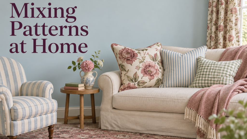
Mixing patterns is one of the most effective ways to give a home character, warmth and personality. A floral sofa with striped cushions, a checked armchair next to botanical wallpaper, or a geometric rug under ditsy-print curtains can look wonderfully collected and relaxed when it’s done well. Done badly, it looks chaotic and busy. The difference comes down to a few simple principles: scale, colour, balance and breathing space.
This guide explains how to mix patterns at home: the main pattern types, designer rules for scale and colour, the rule of three, which patterns pair well, how to mix patterns room by room, where to start if you’re nervous, pattern drenching and maximalism, texture, and the most common mistakes.
Table of Contents
Why Mix Patterns?
Pattern adds depth, interest and personality. Homes & Gardens notes that though mixing florals with stripes, checks with botanicals, or geometrics with animal prints may in theory sound bizarre, the visual tension it creates is precisely what gives a space vitality and character.
Pattern is also very much on trend. Livingetc reports that bringing bold patterns into your space is slated to be a stylish decorating tactic in 2026.
Pattern can also define zones. Ideal Home notes that a bold patterned living room rug idea makes a feature of the seating area in an open plan space, or fab floral fabric draws your eye towards the window in a bedroom.
Understanding Pattern Types
| Pattern Type | Examples | Character |
|---|---|---|
| Florals | Chintz, botanicals, ditsy prints, large blooms | Soft, organic, romantic |
| Stripes | Ticking, candy, awning, pinstripe | Structured, versatile |
| Checks and plaids | Gingham, tartan, windowpane | Classic, country, cosy |
| Geometrics | Trellis, chevron, circles, diamonds | Modern, graphic |
| Abstract | Brushstrokes, organic shapes | Artistic, contemporary |
| Global prints | Ikat, block prints, kilim, suzani | Relaxed, layered |
| Animal prints | Leopard, zebra, tiger | Bold, playful |
| Toile | Pastoral scenes | Traditional, elegant |
| Damask and paisley | Formal motifs | Traditional, rich |
| Texture-led patterns | Bouclé, herringbone, jacquards | Subtle, tactile |
Rule 1: Vary the Scale
Scale is the single most important rule. Homes & Gardens explains that designers say scale is the secret to a cohesive scheme – it allows you to layer even the most contrasting patterns.
Large, Medium and Small
| Scale | Examples | Where to Use It |
|---|---|---|
| Large (hero) | Big florals, bold botanicals, large geometrics | Wallpaper, curtains, sofa, rug |
| Medium (supporting) | Stripes, trellis, damask, mid-scale geometrics | Armchairs, cushions, blinds |
| Small (accent) | Ditsy prints, micro-checks, small spots | Cushions, lampshades, trims |
Spoonflower summarises the approach: Large-scale pattern: your hero print Medium-scale pattern: a supporting print (often a stripe, damask, or geometric) Small-scale pattern: tiny ditsy florals, micro-checks, or subtle textures.
Start With One Large Pattern
Most designers recommend one hero print. Fabrics & Papers advises: A good rule of thumb is to focus on one large-scale pattern, so that the focus of the room is clear. Fabric designer Vanessa Arbuthnott agrees: Limit yourself to one large scale fabric design.
Interior designer Anna Haines suggests a simple formula: ‘A useful rule of thumb is to start with one larger-scale design, introduce a smaller-scale pattern and perhaps a stripe, both of which pick up colors from the larger design,’
Avoid Same-Scale Patterns Side by Side
Patterns of the same size compete. Lance Saunders, a design director quoted by Homes & Gardens, advises: ‘Pay attention to the scale of the pattern. The key is to avoid the same scale of patterns next to each other,’
Livingetc warns that pattern clashing can fall short when there is the same type or print size of pattern, such as two florals or checks with similar colors.
Rule 2: Keep a Common Colour Thread
A shared colour palette ties different patterns together. Bailee Roberts of House Rupert Interior Design Studio explains: If the dominant hues are consistent, the patterns will gel beautifully and tie the look together,’
Dara Caponigro, quoted by Livingetc, advises using different scales and trying to have a common color thread carried throughout.
How Many Colours?
Vanessa Arbuthnott recommends that you limit the colour palette; we would recommend up three as a good starting point. The larger the space, then you could consider up to five.
Colour Approaches
| Approach | Effect |
|---|---|
| Tonal (shades of one colour) | Calm, sophisticated |
| Two or three colours repeated | Cohesive, layered |
| Complementary colours | Lively, bold |
| Muted colourways | Cosy, relaxed |
| Neutral patterns with one bold print | Balanced, easy |
Muted colours make mixing easier. Fabrics & Papers notes that by choosing more muted colourways, or different designs that share the same colour, you can tone down your concoction of patterns to create a cosy and comfortable interior look.
Rule 3: The Rule of Three
The rule of three is a popular starting point. Designer Andrea Schumacher suggests a good beginning rule of thumb is to mix three different prints in three different scales: one with an organic feel (think floral), another with a geometric pattern and a time-tested classic.
House Digest describes a group of three like one that stands out, one that’s less intense, and one that’s quiet.
Some designers see three as a maximum, others as a minimum. TLC Interiors says: My golden rule is to not mix more than about three patterns in a space. HGTV’s designers, by contrast, argue that three is the minimum number of patterns you should use, and the key to successful mixing is to vary the scale.
The truth is that three is a good starting point. Confident decorators and maximalists can go further, as long as scale and colour stay controlled.
Rule 4: Balance Pattern With Plain
Plain surfaces give patterns room to breathe. Interior designer Sophie Ashby, quoted by Homes & Gardens, says giving patterns space to breathe is key.
The 60-30-10 Approach
One useful way to balance pattern is to think in proportions. One Room Challenge suggests you imagine your room is a pie chart with three chunks (one being solids, one being large scale patterns, and one being small scale patterns), and try using the classic 60/30/10 ratio. For a calmer look, it suggests aim for 60% solids, 30% small scale patterns/texture, and 10% large scale patterns.
White walls can help a busy mix work. Ideal Home describes a living room where the white canvas of the walls and woodwork let the different fabrics – from geometrics to florals to Aztec – work together, without the overwhelming feel one might associate with clashing several patterns.
Rule 5: Mix Pattern Types
Mixing different pattern types usually works better than mixing several of the same. Ideal Home notes that florals and botanicals look fab teamed with checks, stripes and smaller geometric weaves, Ikat prints pair really well will informal spots and small block print designs.
Patterns That Work Well Together
| Pairing | Why It Works |
|---|---|
| Florals and stripes | Softness balanced by structure |
| Florals and checks | Classic country charm |
| Large florals and small florals | Layered, romantic |
| Botanicals and geometrics | Organic meets graphic |
| Stripes and stripes (different scales) | Fresh, tailored |
| Ikat and spots | Relaxed, global |
| Block prints and kilim stripes | Textured, artisan |
| Animal prints and florals | Bold, playful |
| Toile and gingham | French country |
| Plaid and plaid | Cosy, heritage |
Florals and Stripes: The Classic Pairing
Florals and stripes is the most popular combination. Homes & Gardens notes that pairing stripes and florals comes out on top. It’s a classic combination that balances structure and softness with ease.
Interior designer Nathan Turner says: ‘I’ve always loved mixing florals and stripes. They pair perfectly,’
Stripes: The “Neutral” Pattern
Stripes work with almost anything. One designer quoted by Livingetc calls them classic, versatile, and timeless—and almost serve as a “neutral” pattern.
Homes & Gardens notes that stripes are another classic choice that blends seamlessly with florals, abstracts, or any other pattern due to their simple and consistent nature.
Mixing stripes with stripes can work too. One designer says: ‘When mixing stripes I think the key is to mix with more stripes,’ and another adds that even mixing two different stripes can feel fresh if the scales vary!’
Large and Small Florals
You can mix florals with florals, if scales differ. Designer Cecilia, quoted by Livingetc, says: “I like mixing large floral patterns with small florals, and geometric shapes, lines, or checks,”
Rule 6: Add Texture
Texture adds depth without visual noise. Livingetc advises that you mix textures – linen with wool, flocked wallpaper with silk, satin with velvet.
Vanessa Arbuthnott notes that layering patterns involves four main elements: colour, scale, shape and texture.
| Texture | Effect |
|---|---|
| Linen | Relaxed, natural |
| Velvet | Rich, luxurious |
| Wool | Warm, cosy |
| Bouclé | Soft, tactile |
| Rattan and wicker | Natural, light |
| Jute | Rustic, grounding |
| Leather | Sophisticated |
| Silk | Elegant sheen |
Rule 7: Stick to a Style
Patterns from the same era or style often mix more easily. Heywood-Wakefield notes that one of the more flexible tips is to stick with those of the same style. For instance, using three mid-century modern patterns or three contemporary patterns together is often easier to pull off.
Where to Use Pattern in a Room
| Element | Pattern Role |
|---|---|
| Wallpaper | Large-scale hero pattern |
| Curtains and blinds | Large or medium pattern |
| Rug | Grounding pattern (stripes, geometrics, kilims) |
| Sofa or armchair | Hero or supporting pattern |
| Cushions | Small and medium accent patterns |
| Lampshades | Small accent pattern |
| Bedding | Medium or small patterns |
| Tiles | Geometric or encaustic patterns |
| Ceilings | Surprising pattern for drama |
| Upholstered headboards | Supporting pattern |
Rugs as a Grounding Pattern
Rugs often anchor pattern schemes. Designer Bethany Adams notes that a bold stripe can really ground a space and that’s why I love a striped rug.
Room-by-Room Pattern Mixing
Living Room
- Hero pattern on curtains or wallpaper
- Plain sofa with patterned cushions in two or three scales
- Patterned armchair as a statement
- Striped or geometric rug to ground the space
- Patterned lampshades as small accents
A patterned sofa can be a starting point. Sofas & Stuff suggests a good starting point is to use three pattern types in a room, adding layers of interest through a variety of print types. Florals feel fresh when mixed with stripes or checks.
Bedroom
- Floral or toile wallpaper behind the bed
- Striped or checked bedding
- Small-print cushions and lampshades
- Patterned headboard
- Plain carpet or rug
Furn suggests layering patterned bedding with checks and florals, noting cushion and duvet combinations as an easy way to keep it subtle.
Dining Room
- Statement wallpaper
- Patterned chair seat pads
- Striped or checked tablecloth
- Patterned rug under the table
Kitchen
- Patterned splashback tiles
- Gingham or striped blinds
- Patterned tea towels and seat pads
- Floral or botanical wallpaper on a feature wall
Bathroom
- Patterned floor tiles
- Wallpaper (in well-ventilated bathrooms)
- Striped or patterned shower curtains
- Patterned towels
Hallway
- Patterned floor tiles or runner
- Wallpaper above dado rail
- Striped stair runner
Children’s Rooms
- Playful wallpaper or murals
- Gingham, stripes and spots
- Patterned bedding and rugs
- Keep a common colour palette
Open-Plan Spaces
Pattern helps define zones and makes large spaces feel cosier. UK interior designer James Mellan-Matulewicz says pattern can be a great choice to make open concept rooms feel cozy, making the design and layout feel more intentional and well connected.
Where to Start if You’re Nervous
- Pick one hero pattern you love: a fabric, wallpaper or rug
- Pull two or three colours from it
- Add a stripe in one of those colours
- Add a small-scale print or check
- Balance with plains and texture
- Start small: cushions and lampshades are easy to change
- Gather samples: lay fabrics, wallpaper and paint together before buying
Homes & Gardens quotes designer Kailee Blalock: ‘Layering patterns like a designer always begins with a base pattern, something that captures the spirit of the space,’
Pattern Sprinkling
If a full pattern scheme feels too much, try “pattern sprinkling”: adding small doses of pattern through cushions, lampshades, trims and accessories rather than covering walls or sofas.
Pattern Drenching and Maximalism
Pattern drenching means using the same or coordinating pattern on walls, curtains, upholstery and even ceilings. It creates a bold, immersive look. Livingetc suggests you embrace pattern drenching for confident schemes.
Tips for Maximalist Pattern Mixing
- Keep a strong, consistent colour palette
- Vary scale carefully
- Use one dominant pattern repeated across several surfaces
- Add plain areas on floors or furniture
- Use pattern on ceilings for a cocooning effect
- Combine with rich textures
Designer Sophie Ashby calls her approach “happy clashing”: ‘I like mixing and matching patterns – I call it happy clashing,’
Pattern Trends
- Stripes everywhere, from rugs to sofas to wallpaper
- Florals mixed with checks and stripes
- Block-printed linens
- Kilim and global-inspired stripes
- Animal prints as accents
- Gingham and checks
- Pattern on ceilings
- Scalloped and patterned lampshades
Ideal Home notes that designers are seeing lots of textured global-inspired patterns, block printed linens mixed with colourful woven kilim style stripes. These are a great way to introduce pattern to a more neutral living room scheme.
Budget-Friendly Pattern Ideas
| Idea | Why It Works |
|---|---|
| Cushion covers | Cheap, easy to swap |
| Lampshades | Small accent pattern |
| Throws | Easy pattern layering |
| Rugs | Big impact without commitment |
| Peel-and-stick wallpaper | Renter-friendly pattern |
| Tea towels and table linen | Kitchen pattern |
| Bedding | Seasonal changes |
| Wallpapered cupboard backs | Small dose of pattern |
| Reupholstered dining seat pads | Low-cost upholstery |
Standard wallpaper is more affordable than many people think. MyBuilder lists Standard Wallpaper | £5 – £50 per roll and Designer Wallpaper | £60 – £150+.
Common Pattern-Mixing Mistakes
| Mistake | Better Approach |
|---|---|
| All patterns the same scale | Mix large, medium and small |
| Too many large prints | Choose one hero pattern |
| No common colour | Repeat two or three colours |
| No plain surfaces | Balance pattern with solids |
| Two similar florals together | Vary type and scale |
| Ignoring texture | Mix linen, velvet, wool and jute |
| Buying everything at once | Collect pieces gradually |
| Not testing samples | Lay fabrics and papers together first |
| Patterns fighting from different styles | Keep a consistent style or era |
| Pattern on every surface without a plan | Decide where pattern goes first |
Pattern-Mixing Checklist
- Choose one hero pattern
- Pull a palette of two to five colours from it
- Add a medium-scale supporting pattern (often a stripe)
- Add a small-scale accent pattern
- Balance with plains and texture
- Distribute patterns around the room
- Avoid same-scale patterns side by side
- Test samples together in the room’s light
- Step back and edit
- Add or swap small accents over time
Final Thoughts
Mixing patterns successfully comes down to scale, colour, balance and texture. Start with one large hero pattern, add a medium-scale supporting print such as a stripe, and finish with a small-scale accent like a ditsy floral or micro-check. Repeat two or three colours across all patterns, balance them with plain surfaces, and add texture through linen, velvet, wool and jute. Florals and stripes are the classic pairing, while stripes work as a near-neutral that blends with almost anything. Start small with cushions, lampshades and rugs if you’re nervous, and build up to wallpaper, curtains and patterned upholstery as your confidence grows.
Frequently Asked Questions
1. How many patterns should you mix in one room?
Three patterns in different scales is a good starting point, though confident decorators can use more if colour and scale are controlled.
2. What patterns go well together?
Florals and stripes, florals and checks, botanicals and geometrics, and ikat with spots are all classic pairings.
3. How do you mix patterns without it looking busy?
Vary the scale, repeat a common colour palette, balance pattern with plain surfaces and add texture rather than more pattern.